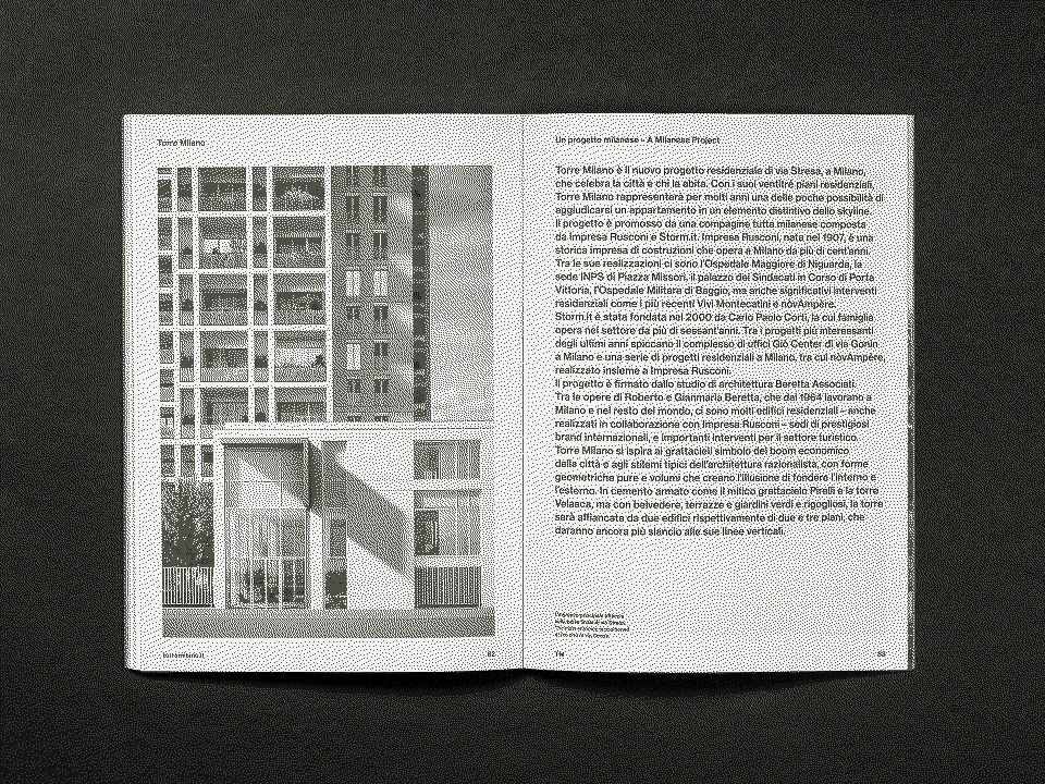
Torre Milano
2019 – 2020
Impresa Rusconi / OPM
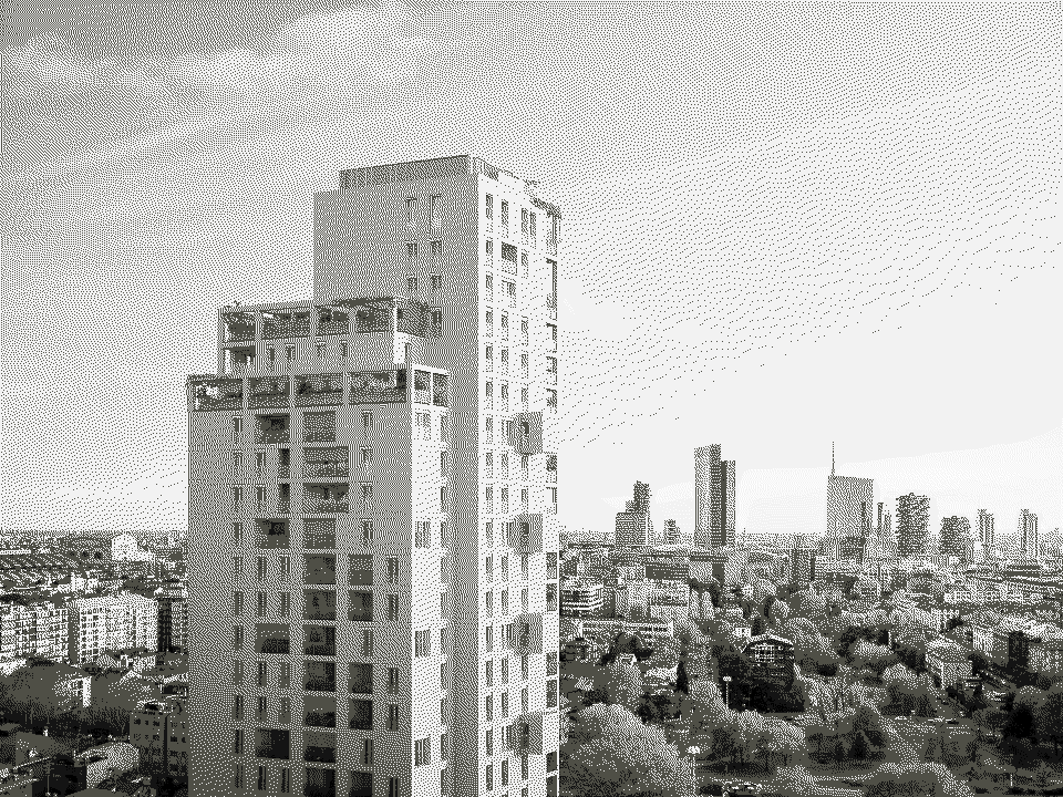
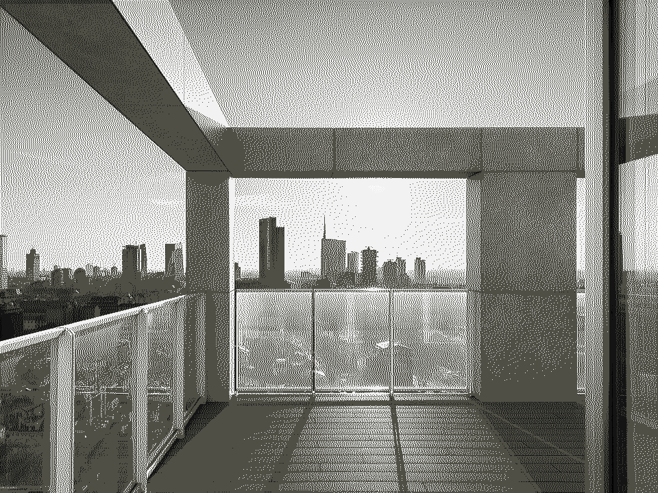
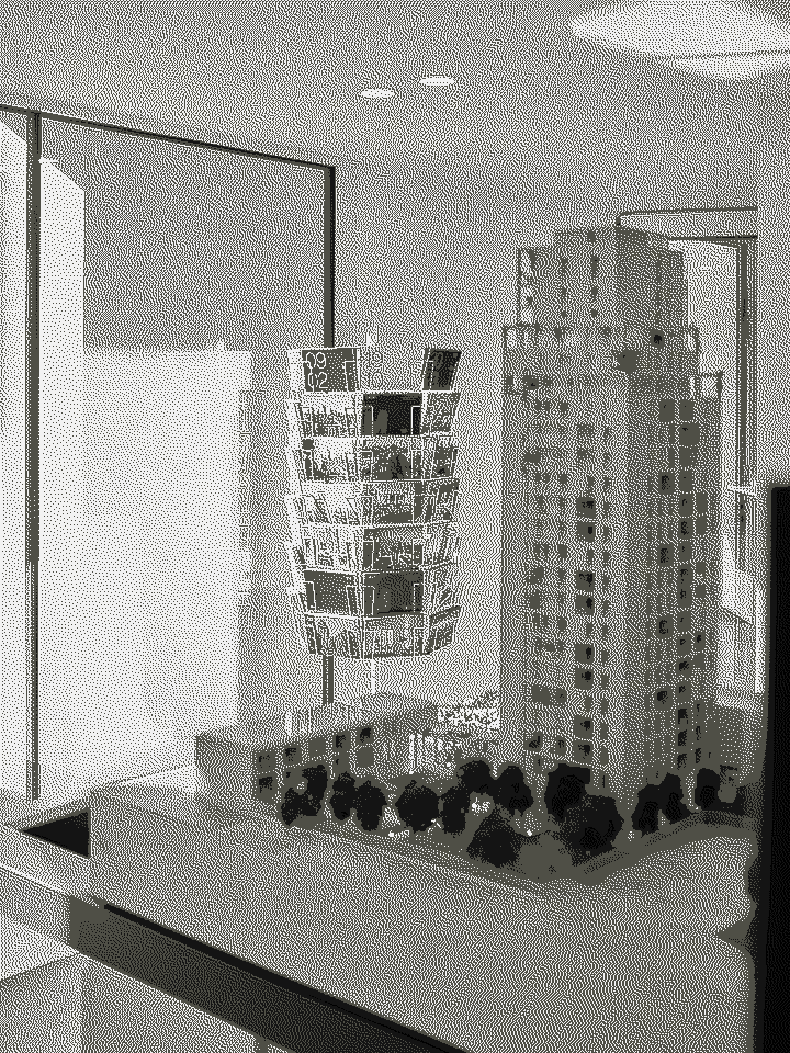
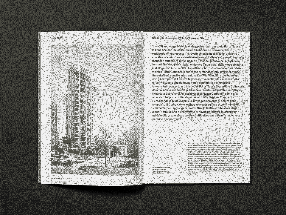
Torre Milano is more than a residential tower—it is a symbol of Milan’s contemporary transformation and a reflection of its rationalist heritage. Designed by Beretta Associati (↗︎), the 24-storey building translates the city’s architectural precision into a new domestic dimension: essential, elegant and enduring.
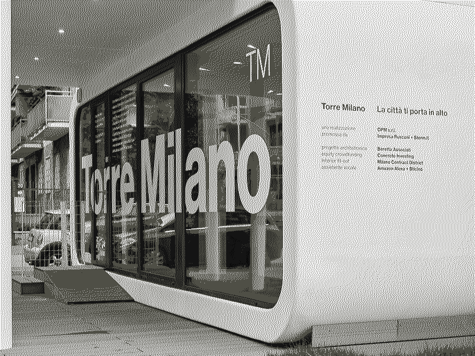
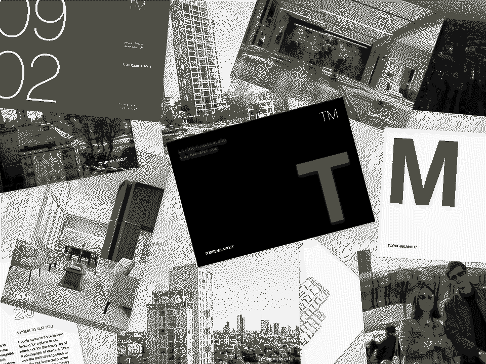
We oversaw the overall art direction of the marketing and communication project, creating an identity that mirrors the building’s compositional rigor and timeless sense of balance.
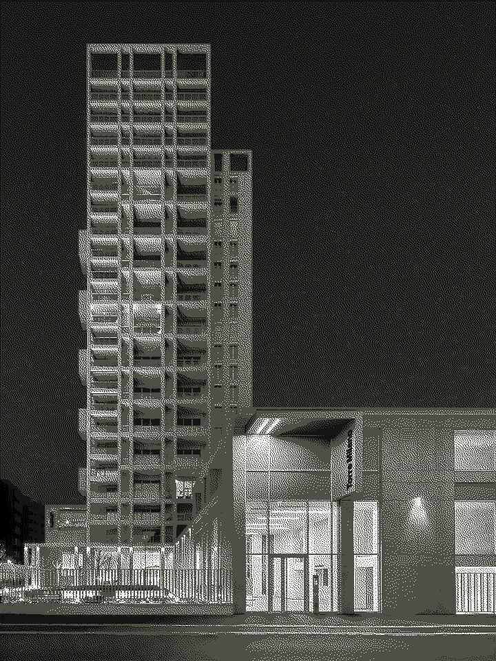
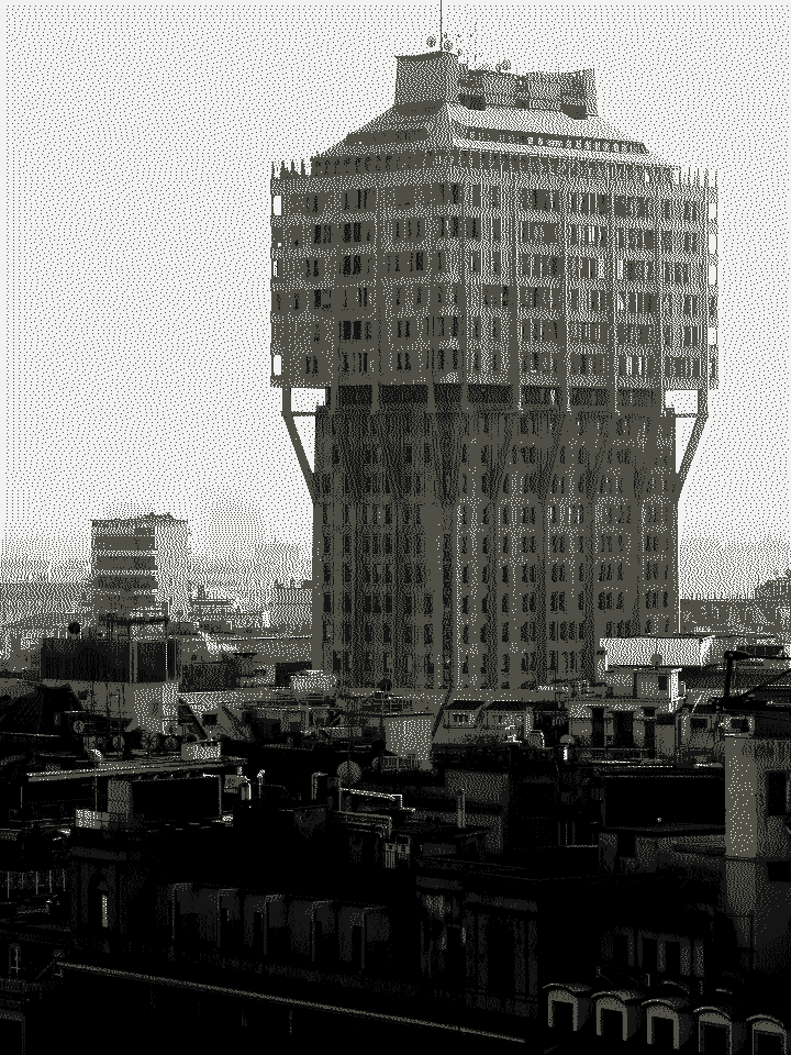
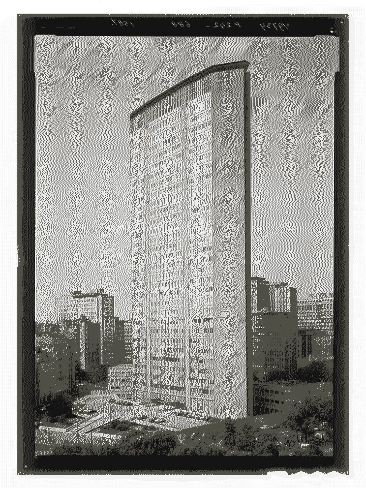
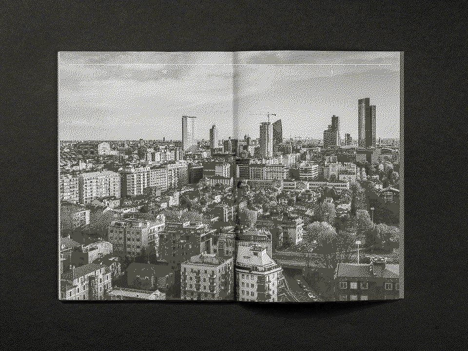
The visual identity is deeply connected to the architectural concept of the tower, which pays homage to the modernist landmarks that shaped Milan’s skyline—from the Pirelli Tower to the Torre Velasca.
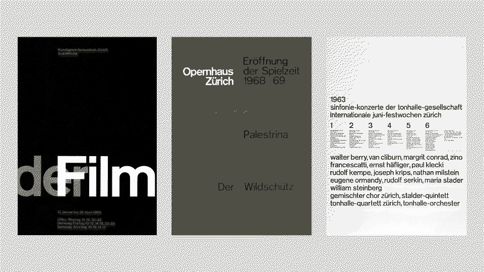
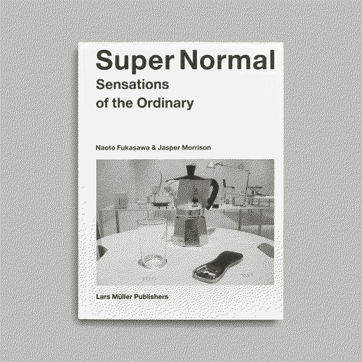
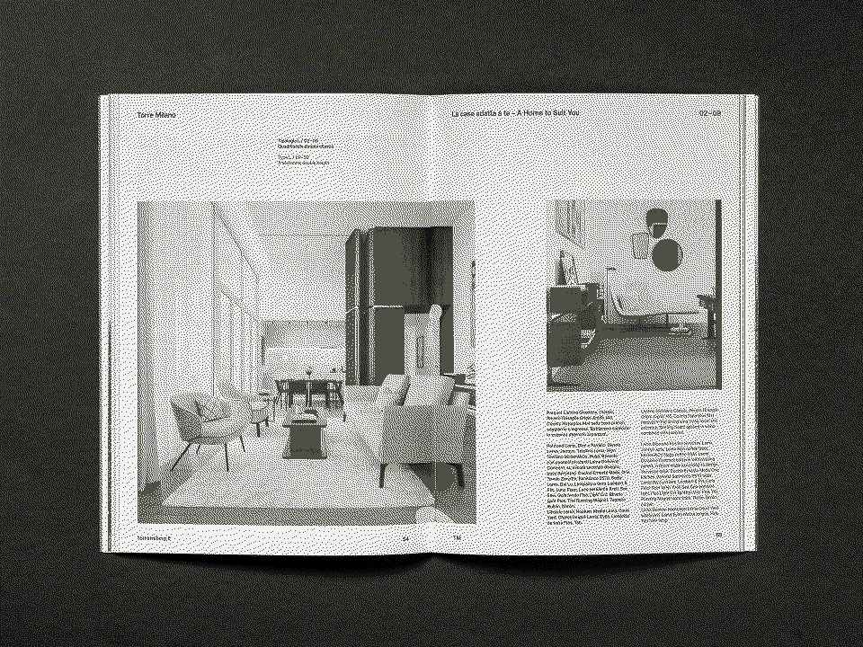
Inspired by the grid-based clarity of mid-century Swiss graphic design and by Jasper Morrison’s Super Normal philosophy, the project combines rational structure with quiet sophistication.


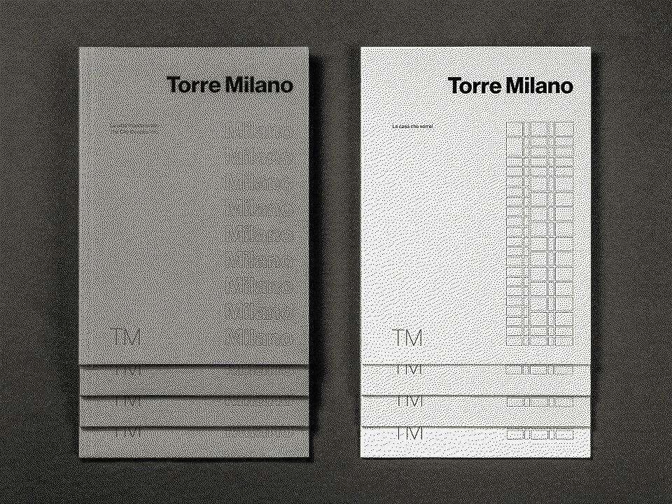
Typography plays a central role: Neue Haas Grotesk Typeface defines the tone with its measured geometry and modernist restraint.
The color palette—white, black and a warm grey—is punctuated only by a Milanese red accent, a subtle reference to the city’s visual identity. The underlying grid becomes a visible design element, giving rhythm and order to the composition across all media.


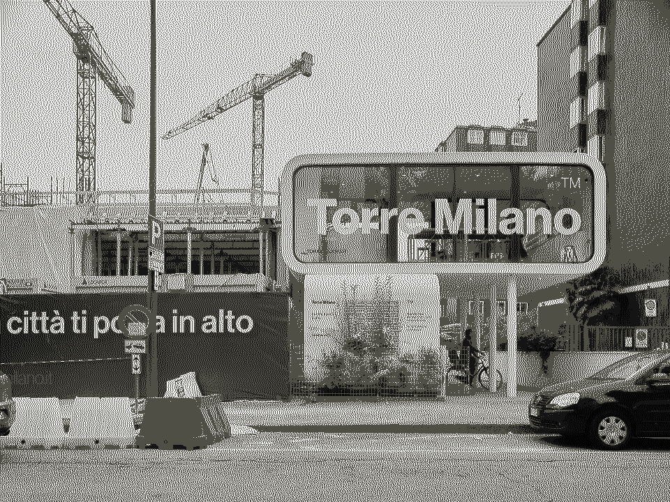
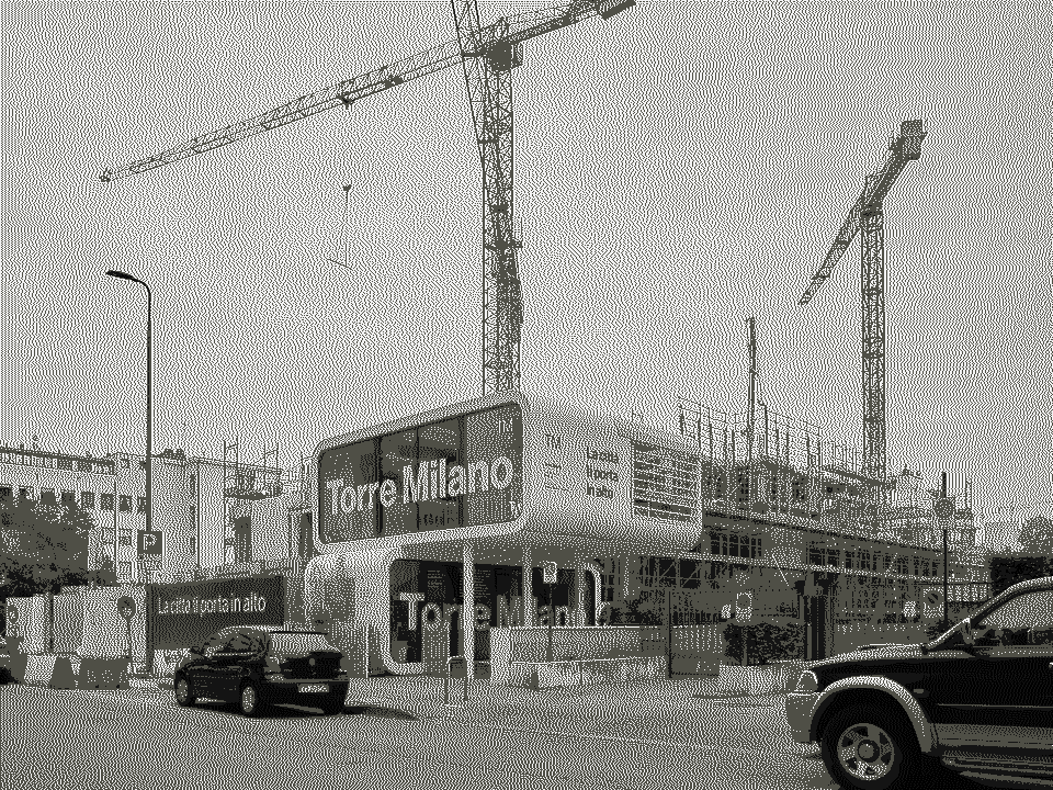
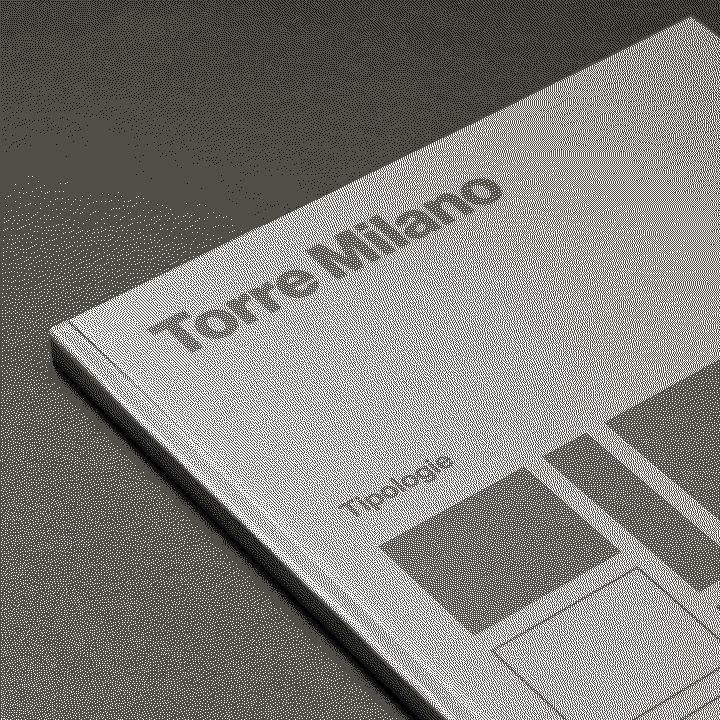
The art direction extended to the production of architectural renderings and to the creation of all communication materials: brochures, advertising campaigns, floor plans, technical documents and the project website.
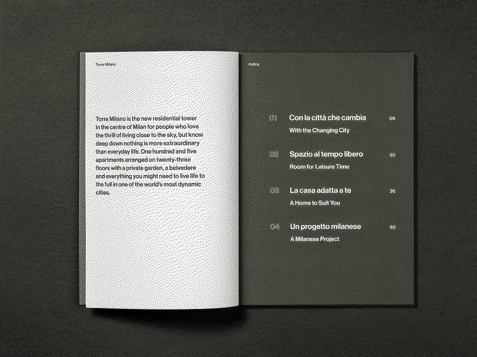
The unified visual system expresses the architectural values of Torre Milano: clarity, precision and a discreet sense of beauty.
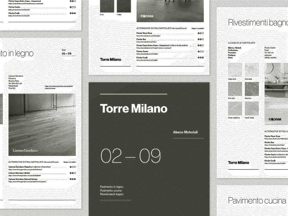

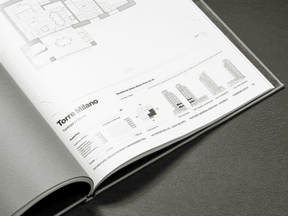
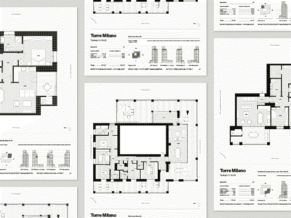
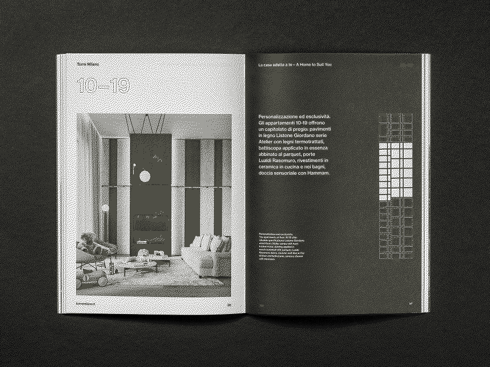
Sales sheets with floor plans, dimensions, orientation and key details—an essential tool for guiding client meetings.