Mia-Care
Mia-Care, the healthcare vertical of the Mia Platform (↗︎), empowers life sciences and healthcare companies to bring digital solutions to life faster and at scale. This mission was translated into a visual identity that conveys innovation, clarity and trust, blending the platform’s digital nature with the visual language familiar to the medical and healthcare sector.
Mia-Care enables MedTech companies to bring digital-compliant solutions for medical software to the market.

For Mia-Care, we developed a visual identity system rooted in the symbolic reference of the DNA double helix, evoking health, innovation and the life sciences sector.
The helix shaped the logo and inspired a modular graphic language, extended to a color palette, typography and a comprehensive set of icons and illustrations.


Styrene Family by Commercial Type (↗︎), was selected as the primary typographic voice for the brand due to its simplicity and clarity.
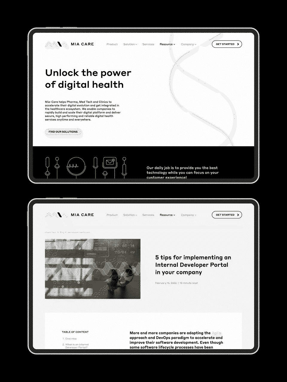
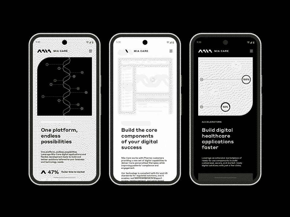
The visual language allows Mia-Care to communicate its platform—which enables faster, smarter and secure software development—in a visually cohesive, approachable and immediately understandable way across digital platforms, reports and marketing materials.


Icons and illustrations are designed to represent services, solutions and platform benefits in a clear and engaging way.

A clean, human-centered digital experience integrates institutional content, product information and editorial features.